
Fixing the part of Careem Pay that most customers never finished.
More than 60% of customers dropped off on the first KYC screen. Another 35% dropped on the second. I led the work from clearer onboarding experiments to the decision that finally moved completion: changing the provider.
Careem Pay lived inside a much larger system.
Careem had grown from ride hailing into food delivery, groceries, money transfer, laundry, and other services. Uber acquired the company for $3.2 billion in 2019. That scale gave Pay an enormous surface area, but it also meant that changing one part of the experience depended on teams across the SuperApp.
I was managing three designers, leading the Pay rebrand, and still working as an IC on a key product pillar. We were improving an existing product in a difficult environment, with limited customer knowledge and dependencies everywhere.

The flow lost people before they could send money.
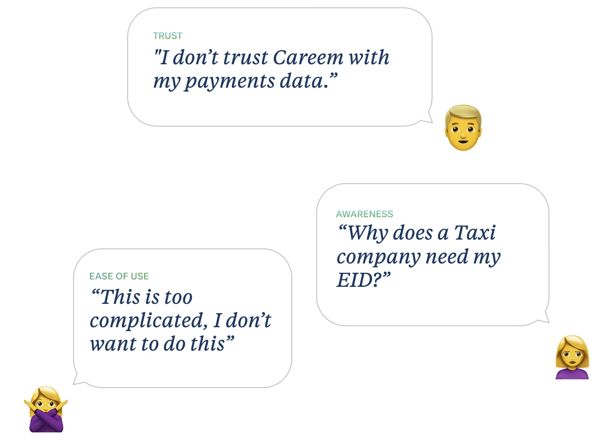
Almost any action in Careem Pay led to a KYC screen. Customers reached it without understanding why a company they still associated with taxis needed an Emirates ID, how their payment data would be handled, or how much work was waiting for them.
First screen
60%+
of all customers stopped here.
Second screen
35%
of the customers who remained stopped here.
Analytics showed where people left. Research explained why:
I started with the cheaper hypothesis.
If the flow explained the value of verification, moved KYC to a better moment, and made the steps feel more trustworthy, more customers should finish it and send their first payment.
- What we measuredCompletion of the full KYC flow and the first payment that followed it.
- Experience targetVerification in five minutes or less.
- Why this came firstWe could test the explanation and the placement before committing to the slower provider replacement.
We tested two ways to make the existing flow easier to understand.
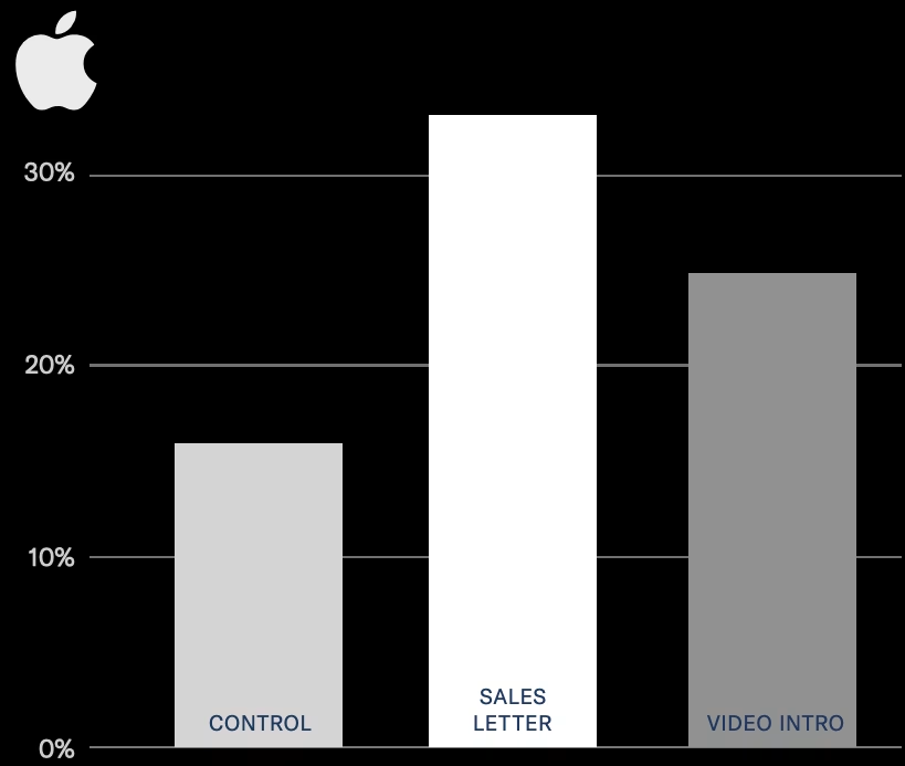
The first concept used a sales-letter approach to explain the value and build comfort. The second moved KYC later, added an explainer video, and redesigned the first screen. Both were attempts to earn trust before asking for identity documents.
Sales letter: explain the value before asking customers to verify.
Video introduction: move KYC later and explain what will happen.
What happened
The sales-letter concept produced the strongest result of the two experiments.
The first win was nice, but it did not make the underlying flow good.
The sales-letter version performed better. But I did not want to mistake that result for a solved problem. We had found a clearer way to introduce a provider experience that customers still did not trust or understand.
The experiment earned its place because it improved the flow and gave us evidence. It also made the next decision easier to defend: stop spending design effort on explaining the provider’s limitations and replace the provider.
The larger gain came from changing the KYC provider.
The earlier experiments clarified the problem and showed where the existing flow topped out. Replacing the provider took longer, but it let us change the experience customers were actually being asked to complete.
The result
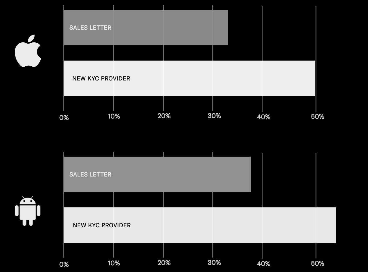
Once the new provider shipped, completion moved from roughly one-third with the sales-letter approach to about half on both iOS and Android.
I would make the same sequence of decisions again.
Test the cheaper intervention, use it to learn, and fund the structural fix when the result shows where the ceiling is. In this case, clearer design helped. Replacing the provider changed the product.